

Sprout Wellness
Optimizing an employee benefits platform
My Role
For this project I worked with 1 project manager, 2 customer success managers, and was guided by our lead UX Designer. I presented the final designs to our stakeholders.
Background
Sprout Solutions is a B2B Saas company that has HR and payroll products for mobile and web. After interviewing users and stakeholders, a plan was put in place to redesign the Wellness product.
Scope
UX/UI Design, User Testing, User Interviews, Research, Pitch presentation
Tools
Figma, Figjam, Jira, Photoshop
Making redeeming and browsing employee benefits fast and easy.
Sprout Wellness is an employee benefits product under the Sprout Ecosystem, which comprises HR and payroll products. Team developed a strategy to re-invent the Wellness product that would simplify and improve the experience of redeeming benefits.
Problem
Low engagement and Lack of information
The company has seen low engagement with employees redeeming benefits from the Wellness section. 80% of Sprout HR users mentioned not knowing where to find the section and needing to others for help. The current platform runs on Calendly page so employees did not know how many times they could book sessions or what the cost would be.


Navigation from Sprout HR to Wellness Calendly Page
Goal
Increase engagement by building an employee benefits platform
The company set out the goal of increasing the use of the benefits platform (Wellness) by expanding the deals and giving Wellness its own platform.

Research
Why haven’t users utilized the current product?
I began with conducting an audit of the current process for locating the Wellness page and redeeming a session using the Calendly page. I was then given an opportunity to meet with several users of the Sprout HR platform.
While conducting interviews, we wanted to find out why users weren't using the wellness page. Below is a summary of user interviews and personas created based from interviews.

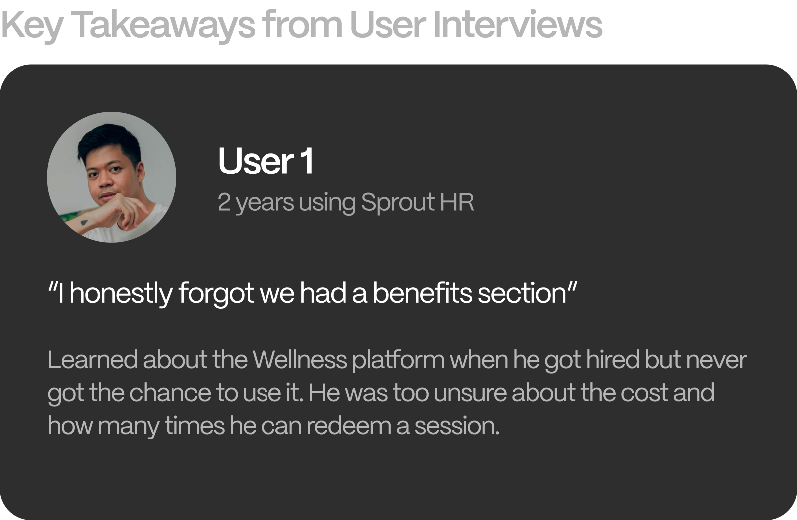


Through conducting interviews, we gained deeper insights into why the platform experienced a decline in usage. Users we interviewed expressed confusion and concerns about the platform, which helped us identify issues that were affecting its usability. We also observed that users were more inclined to book a session once the platform was made clearer to them. We noticed a recurring pattern of users who refrained from using the platform due to doubts or uncertainties they had about it.
Insights


Success Metrics
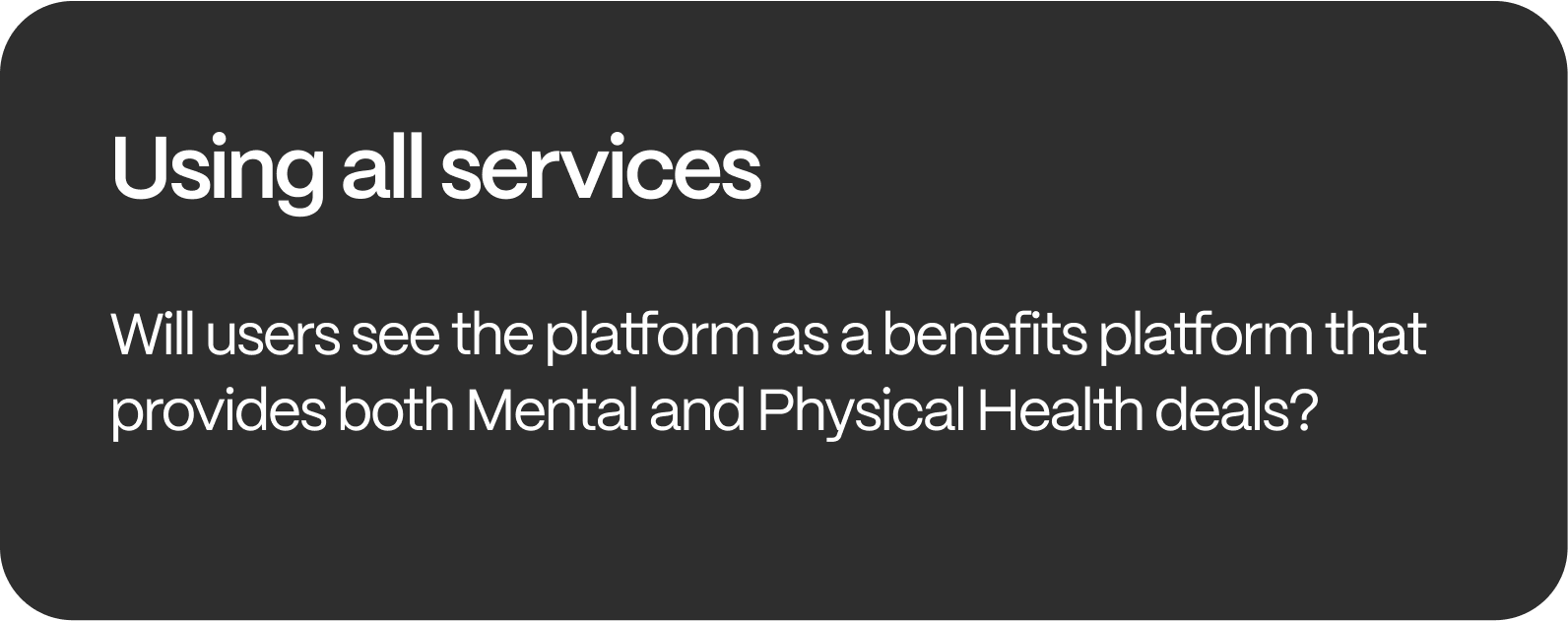
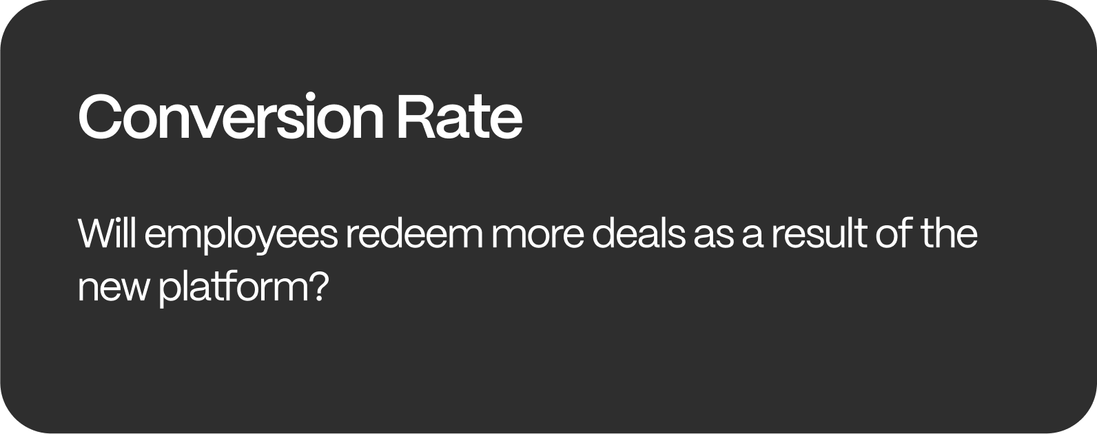
How we can determine the new approach will be a more reliable product to users.
The success metrics below focus on concerns we gathered during user interviews regarding the previous platform.

Ideation
Target the main reasons why users have stopped using the Wellness platform
After identifying the main reasons why employees have not been using the Wellness platform, the next step is to develop ideas how we can revamp the wellness platform as a dependable product for the employees.
The variations below focused on addressing the user’s hesitance of redeeming sessions due to the uncertainty of cost and confusion with Wellness being a mental health platform.

Development
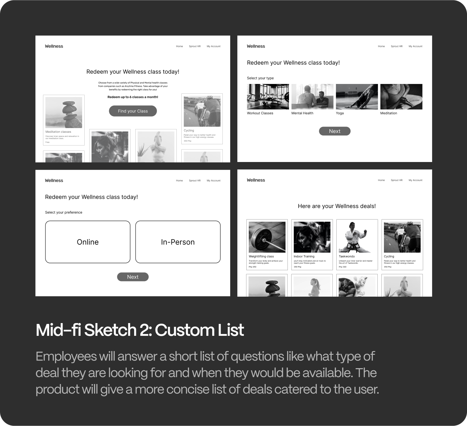
Mid-Fi sketches with 2 divergent directions
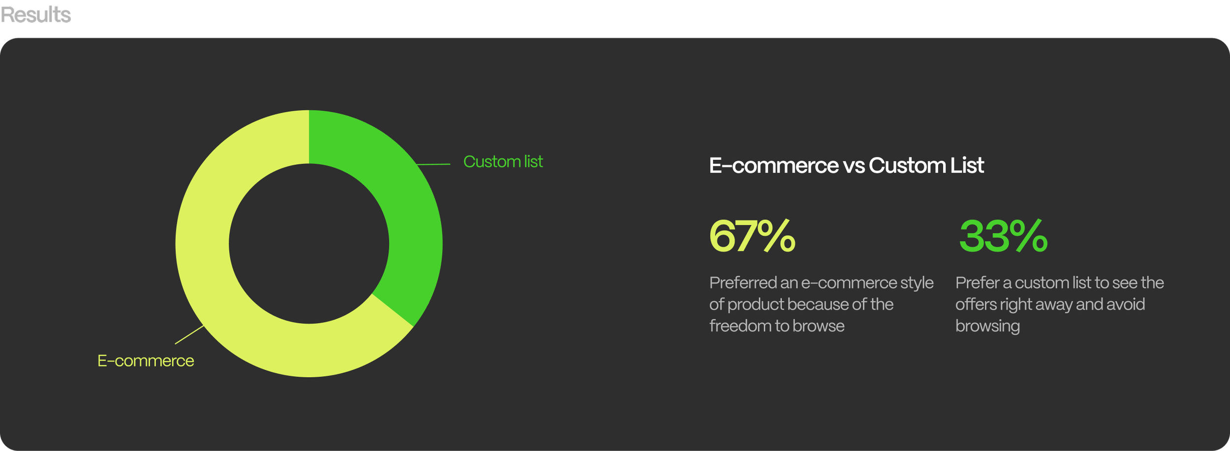
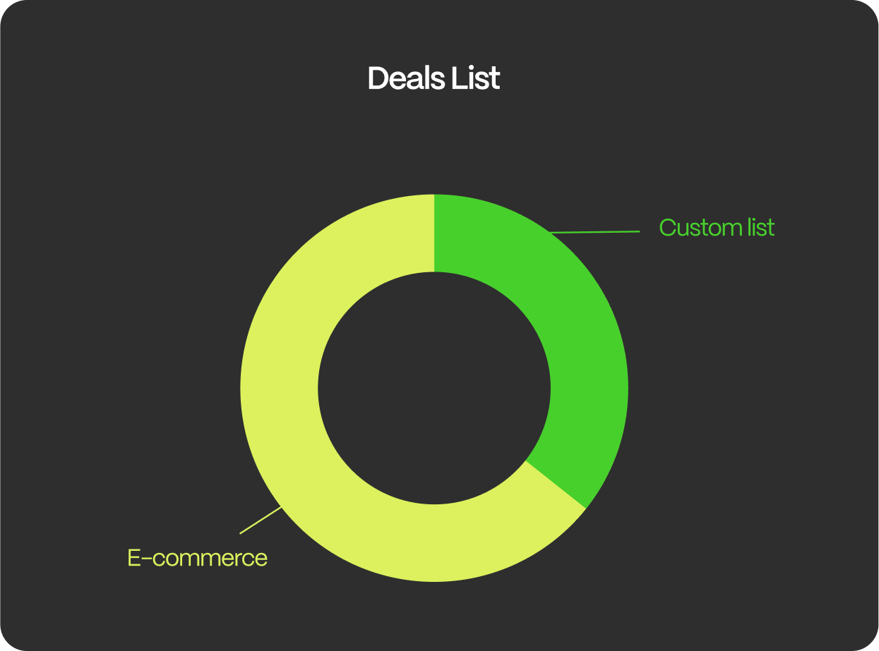
Following the Crazy 8 exercise, we developed multiple sketches and ultimately narrowed down two possible directions for the platform that would address most user questions and concerns. These two mid-fidelity prototypes included an e-commerce platform and a custom list platform.

Through conducting interviews, we gained deeper insights into why the platform experienced a decline in usage. Users we interviewed expressed confusion and concerns about the platform, which helped us identify issues that were affecting its usability.
We also observed that users were more inclined to book a session once the platform was made clearer to them. We noticed a recurring pattern of users who refrained from using the platform due to doubts or uncertainties they had about it.
User Testing

Information & Architecture

The new site map simplifies the existing process of going from Sprout HR to Wellness. The map focuses on having the introduction of Wellness having a marketplace, then showing the variety of deals available to employees.
Final Design

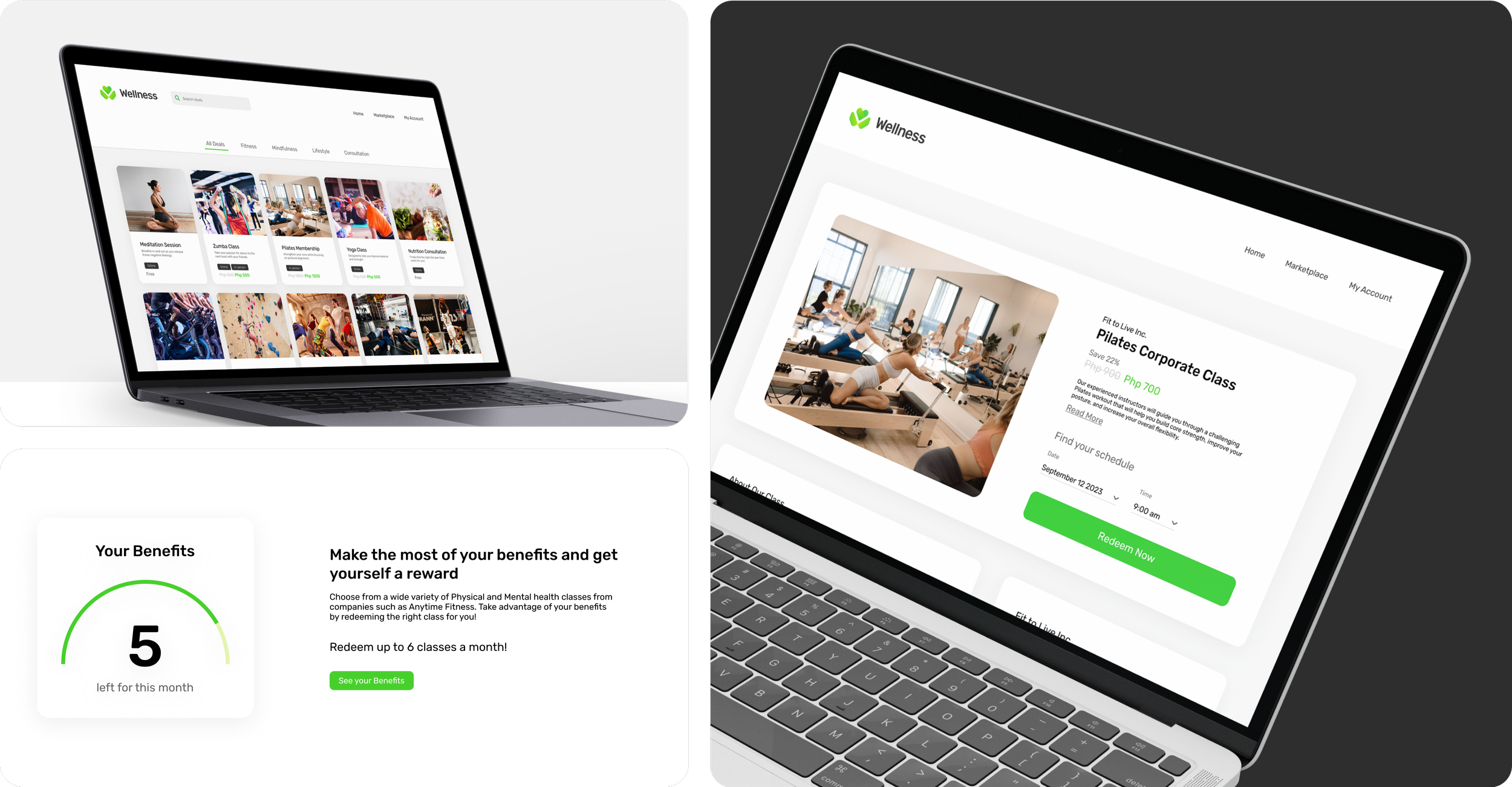
Introducing Wellness as the marketplace for deals exclusive to Sprout HR users.
By using an e-commerce style of platform for Wellness, we were able to use the landing page as a way for employees get a better idea what they can expect when browsing the platform.
Showcase what type of deals they can expect
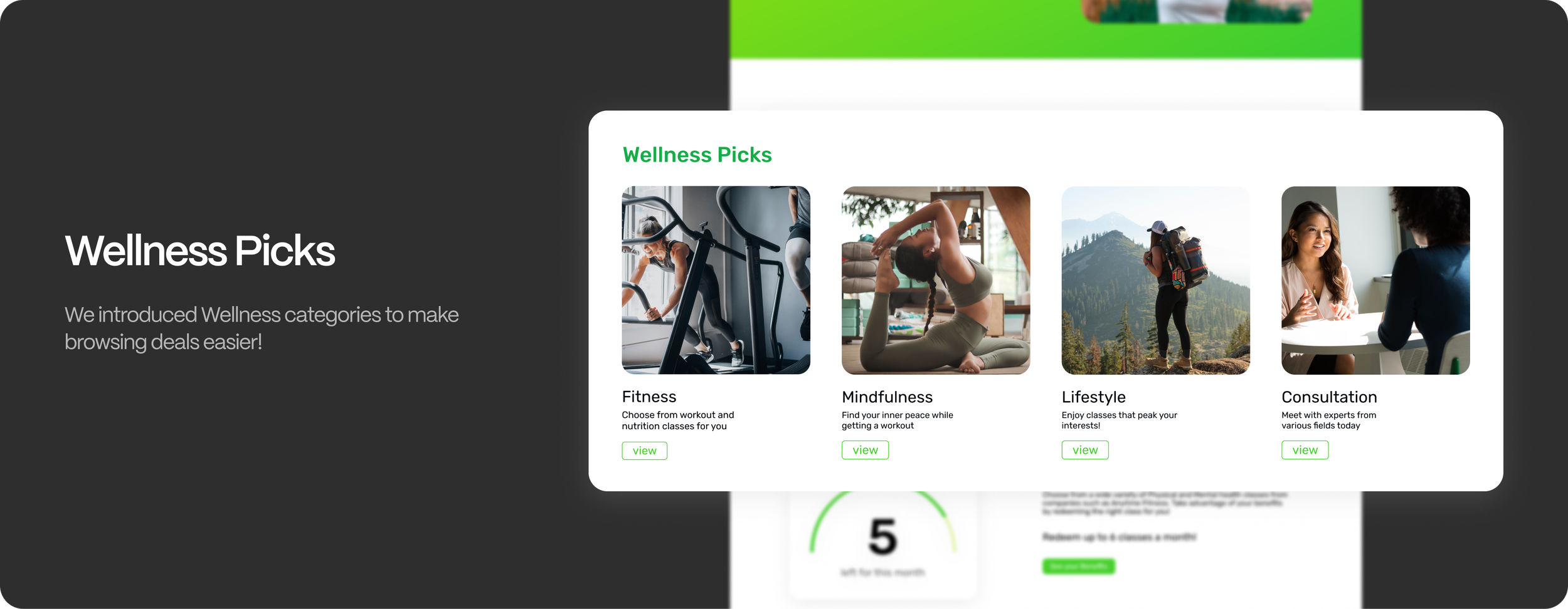
We added a category section below the hero section of the Wellness page, allowing employees to quickly and easily view the types of deals available for redemption. This was implemented to simplify the browsing experience and provide users with a better understanding of the type of deals they can access.
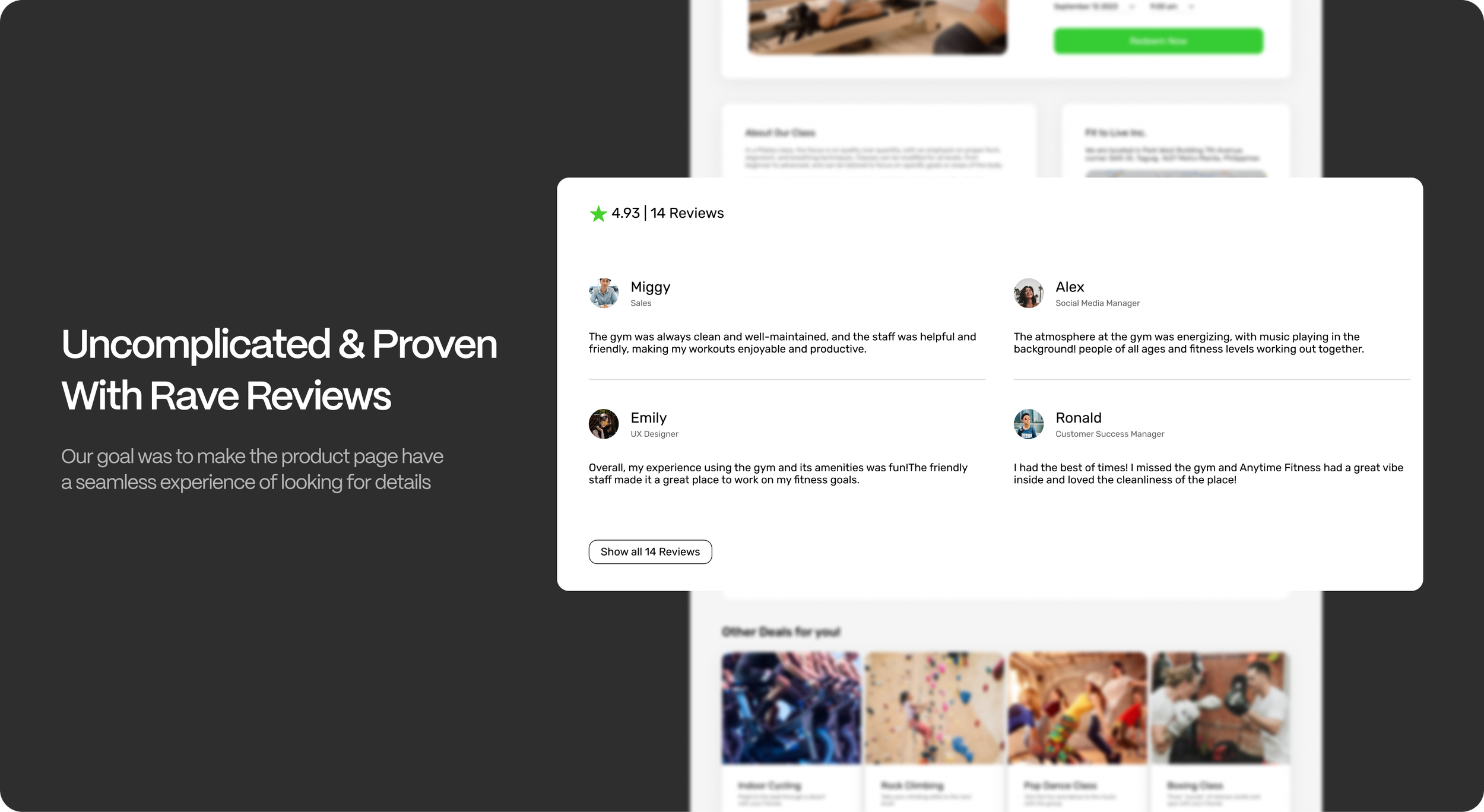
it’s easy to redeem deals!

Our goal is for users to maximize their Wellness benefits! we made this section to give users a better idea how many times they can redeem deals.

Retrospective
Designing with business goals in mind
Sprout Wellness aimed to expand its network of partners to increase the variety of benefits offered. This objective was emphasized to provide a clear direction for designing the marketplace and product page.
Working within a large design team
I had the privilege of being part of the Sprout product team, who provided me with the necessary assets for Sprout version 2.0. Working with the team, I was able to receive valuable feedback and align the design direction for Sprout Wellness accordingly.